June 7, 2017
Here at Via, we all know the pie lies. The pie chart that is. So imagine one team member’s surprise when she receives a text asking her where a 2D or 3D pie chart is better…!
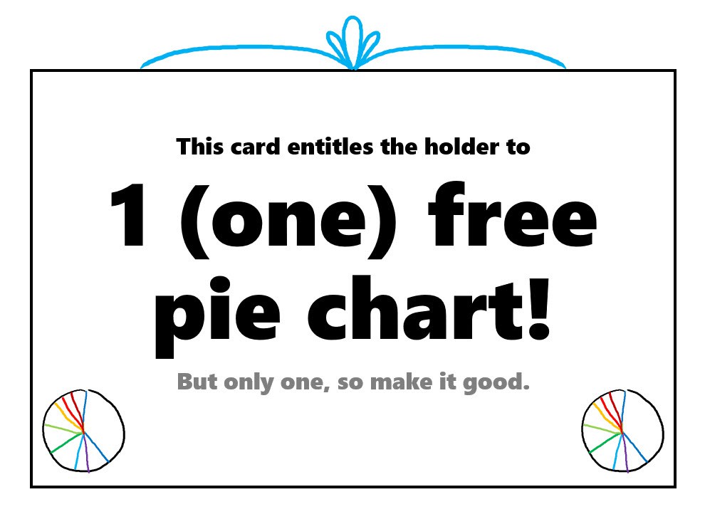
We love data visualization here at Via, and would never want to discourage an attempt at what we lovingly call “dataviz”. InsPIEred by dataviz wizard and Excel ninja Stephanie Evergreen (link for her blog here), we are granting all the pie lovers out there 1 FREE PIE CHART! With that one free pie pass, we’d like to share just a few pie chart tips from Evergreen herself:
- We humans are not very good at judging angles, so use as few slices as possible.
- Have a great title.
- Arrange your (few) slices from largest to smallest, starting at noon and moving clockwise.
Data displayed in graphs is more persuasive, making data visualization a powerful tool. If you need support in visually telling your story in numbers (or just some help in avoiding the pie), contact Via today! By phone (716) 362-0627 or by email [email protected]